Key to great business leadership lies within numbers. Our goal is to provide tools and software to make data visible to leaders and teams.
00
Introduction
This is the guideline for all the brand elements that make up the Talgraf Visual Identity. A brand is a work in progress and evolves over time and use. Here you can find the core brand marks, colors, typography, and photography that altogether define our new direction. Use these guides when working on Talgraf materials.
00
Brand Philosophy
We are lifelong learners and thought leaders, and mentors for our clients. We hope to assist others in altering the world by sharing and highlighting valuable information through our software and services. Our visual identity is based on fundamental principles that express our message. When you are creating content with Talgraf, remember this and maintain a coherent message and support for our brand positioning and unique expression.
00
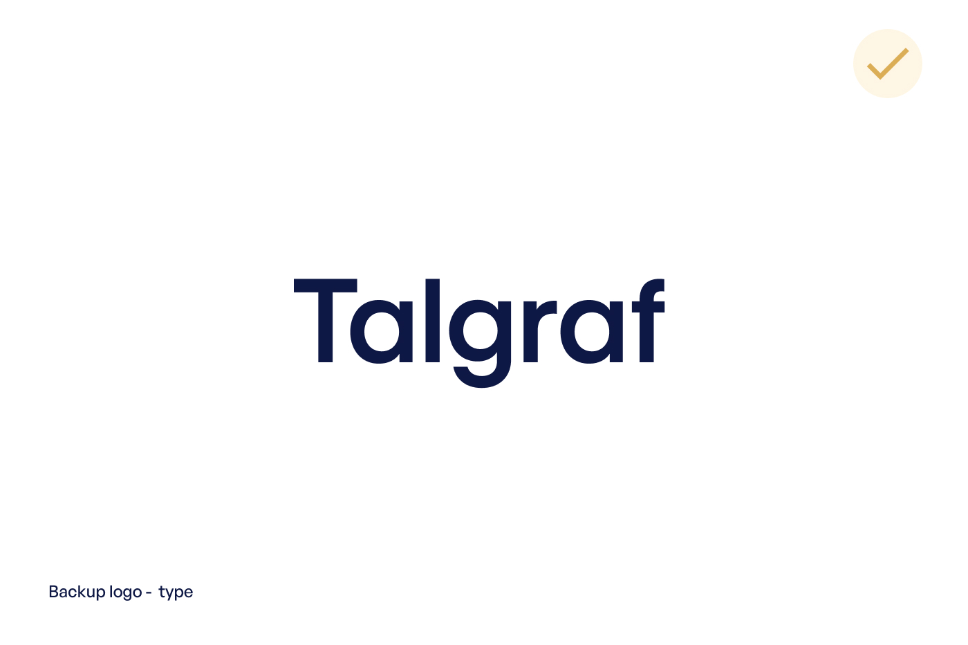
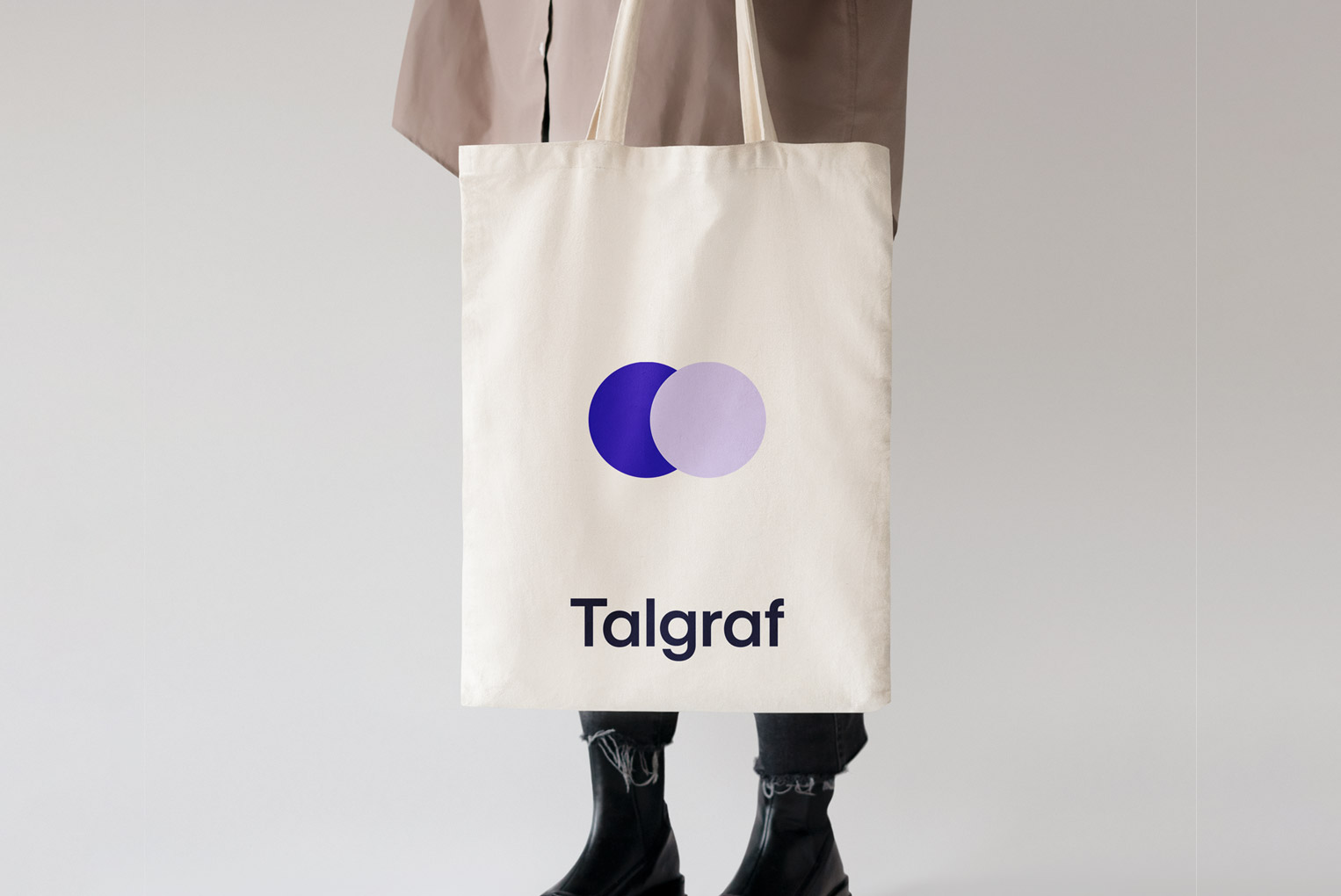
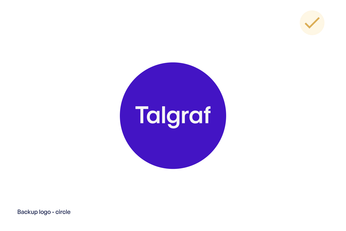
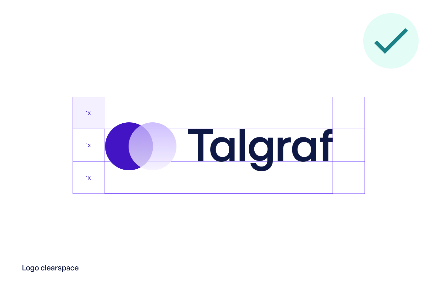
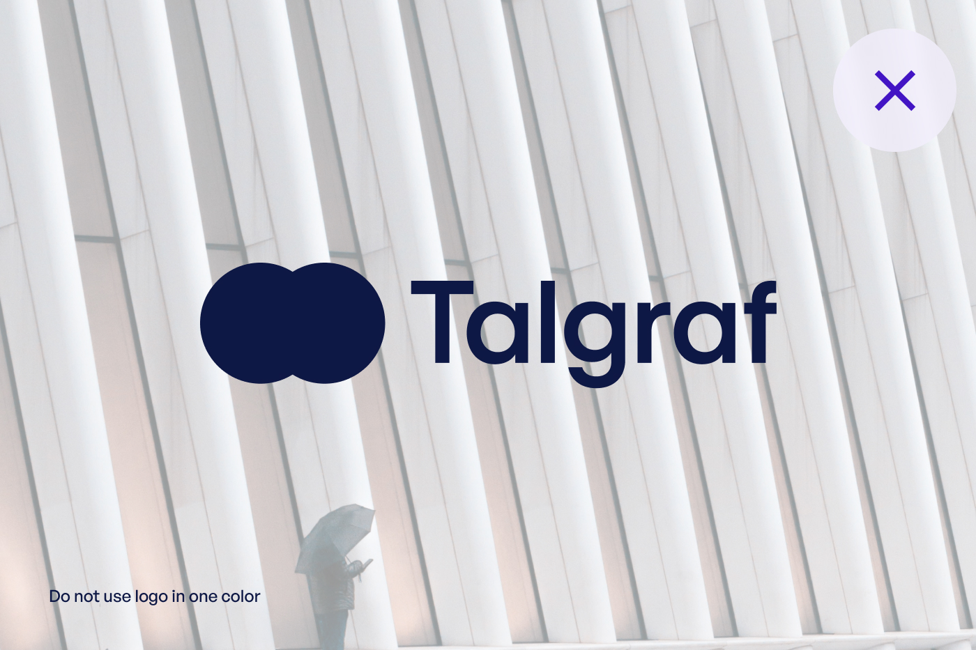
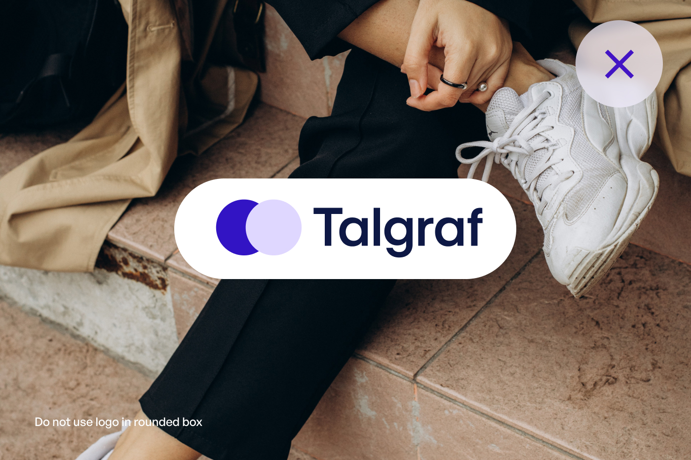
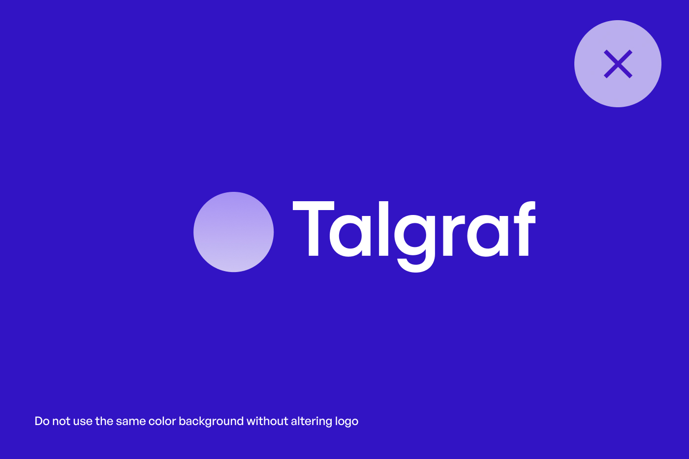
Logo
Our logo is present across all of our activities, and we urge you to follow the guidelines listed below to ensure the optimal experience.
00
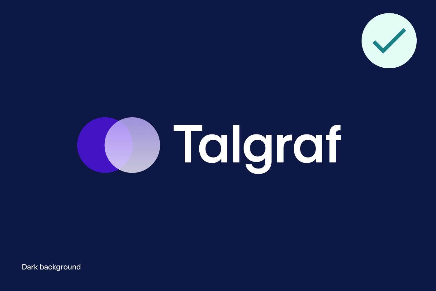
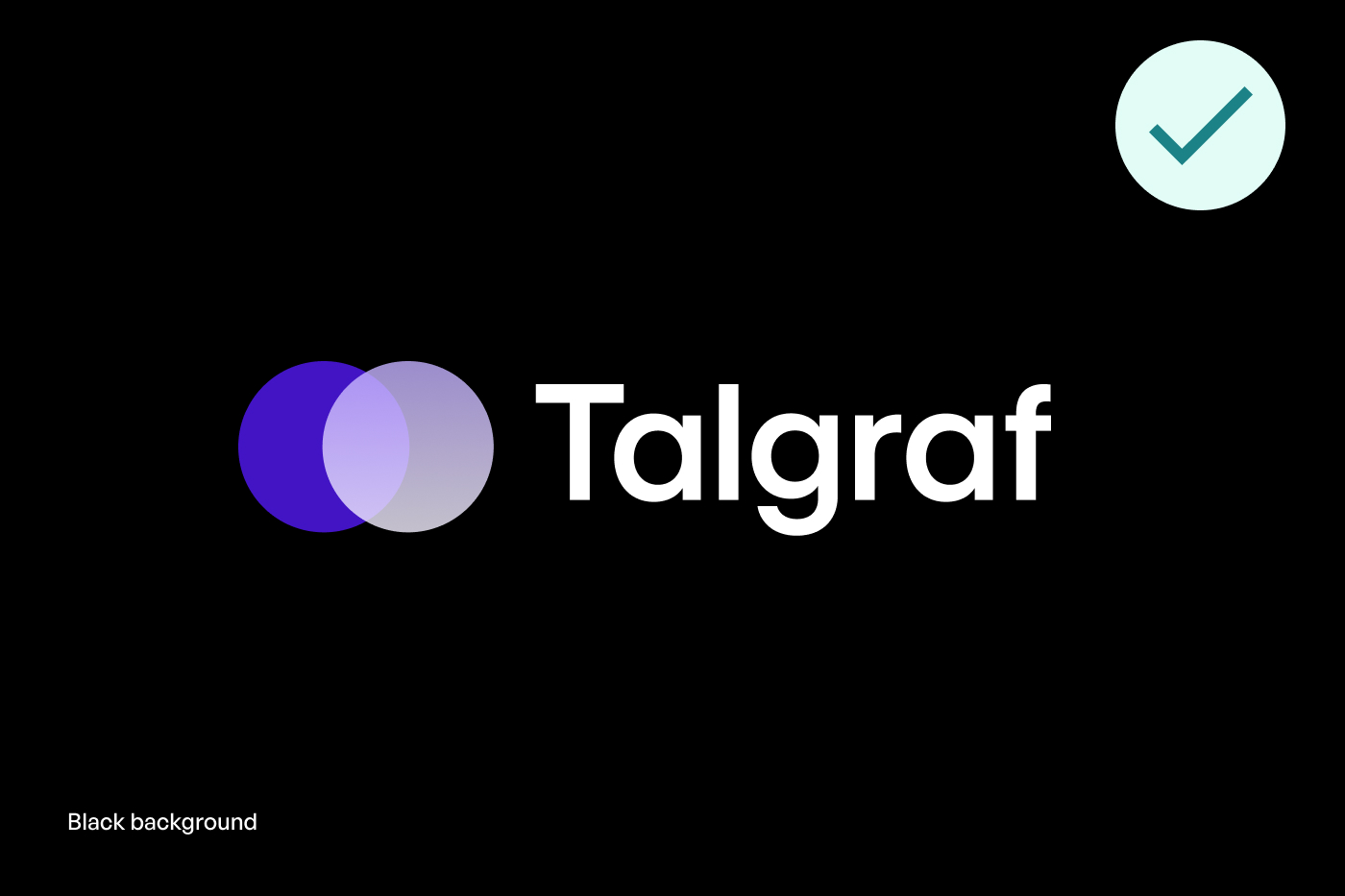
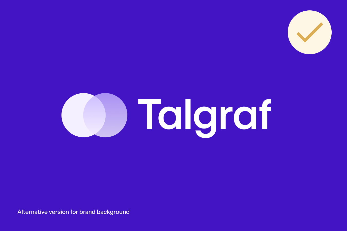
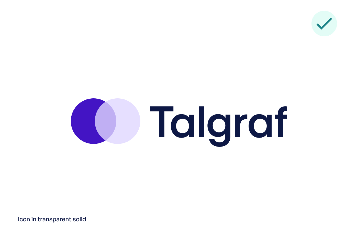
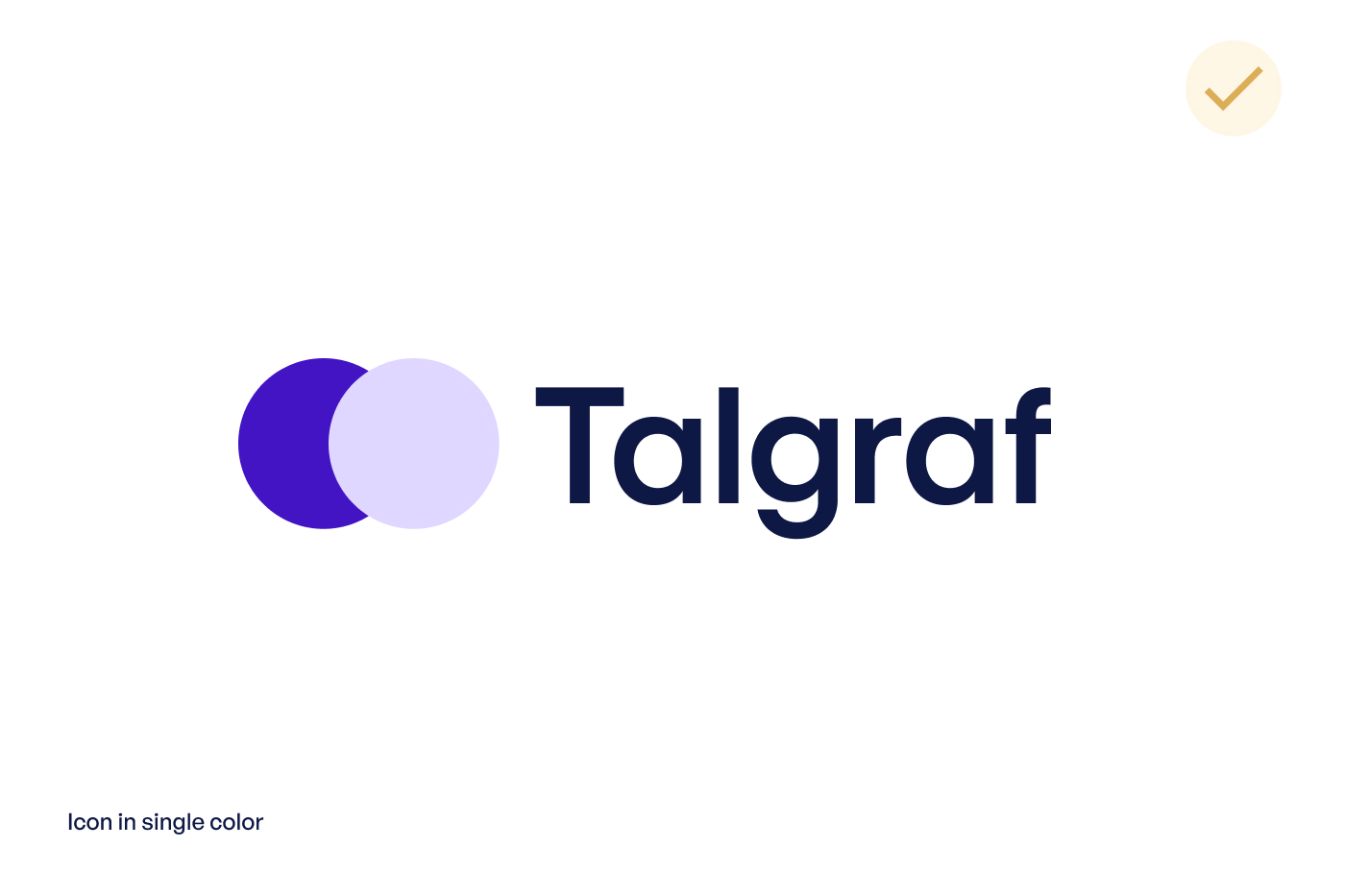
Icon
Talgraf brand icon can be used independently or in co-relation with the logotype. We urge you to fearlessly use it as an independent mark as well. Icon versions differ depending on whether the image is used digitally or offline. Explore and experiment with different options. You can download all the logo assets from the bottom of this page.
00
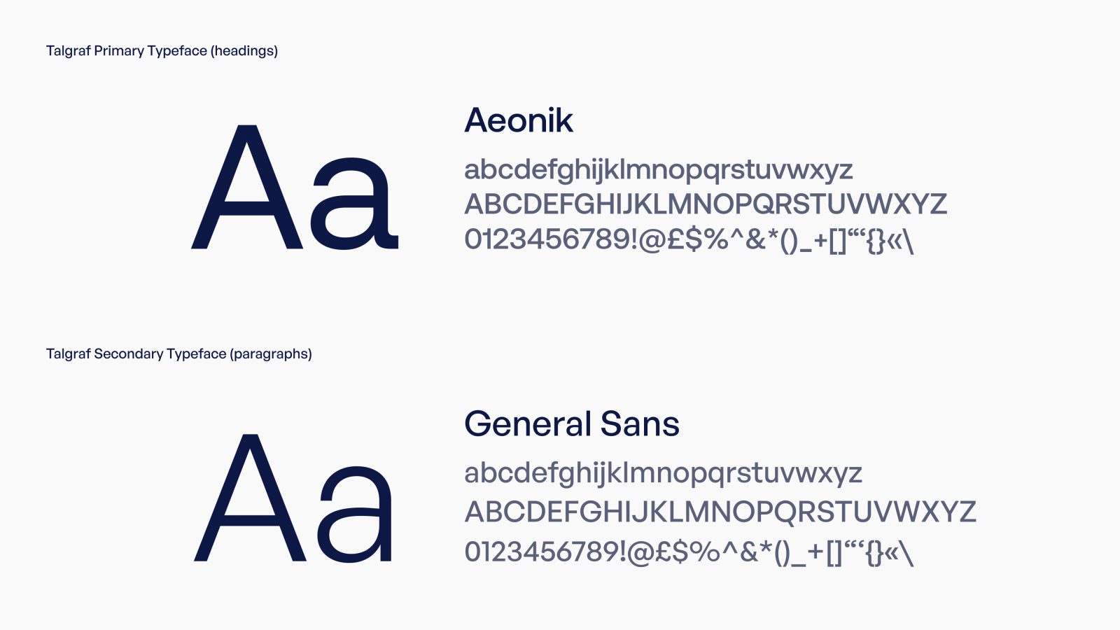
Typography
Use Aeonik with headlines and large texts. With Modernist roots but details referencing mechanical early Grotesks, Aeonik positions itself as a Neo-Grotesk with a Geometric skeleton; with proportions that are wider than a typical Grotesk, but thinner than a typical Geometric Sans. Structurally, this creates a fantastic balance for both display and text use.
Use General sans for paragraphs and small text. General Sans is an excellent selection for use in branding, or in other kinds of corporate identity design. It may also be put to good use in editorial designs for publications about contemporary lifestyle issues.
00
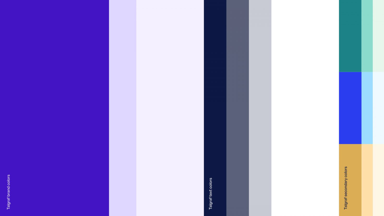
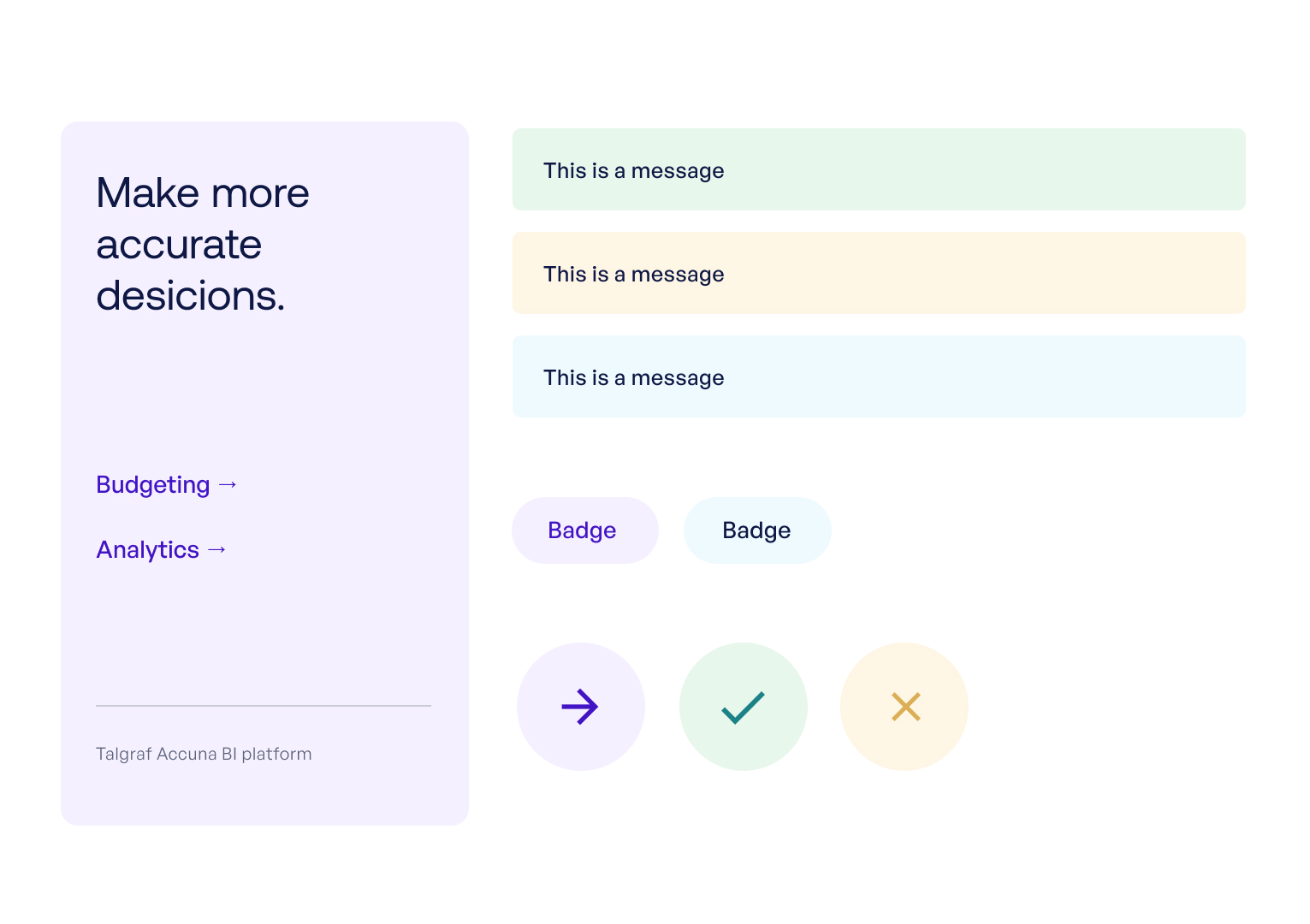
Color Usage
Our primary color palette is based on shades of violet-blue. This is the foundation of our visual communication. Supporting colors are used in a minor role and in smaller details such as UI, data, and highlights. Text colors are designed to work optimally alongside the main colors.
00
Brand Colors
Talgraf Primary
PMS 2735
RGBA 66 20 196
#4214c4
Mid
PMS 7446
RGBA 224 215 255
#e0d7ff
Light
PMS 7443
RGBA 245 240 255
#f5f0ff
00
Text Colors
Text Primary
PMS 2768
RGBA 14 24 68
#0e1844
Gray
RGBA 91 97 121
#5b6179
Light
RGBA 201 203 212
#c9cbd4
White
#ffffff
00
Supporting Colors
#dbae56
#fee1a7
#fef6e5
#2b3ff1
#9bdcff
#eefaff
#1c8287
#8bdbcc
#e8f7ec
00
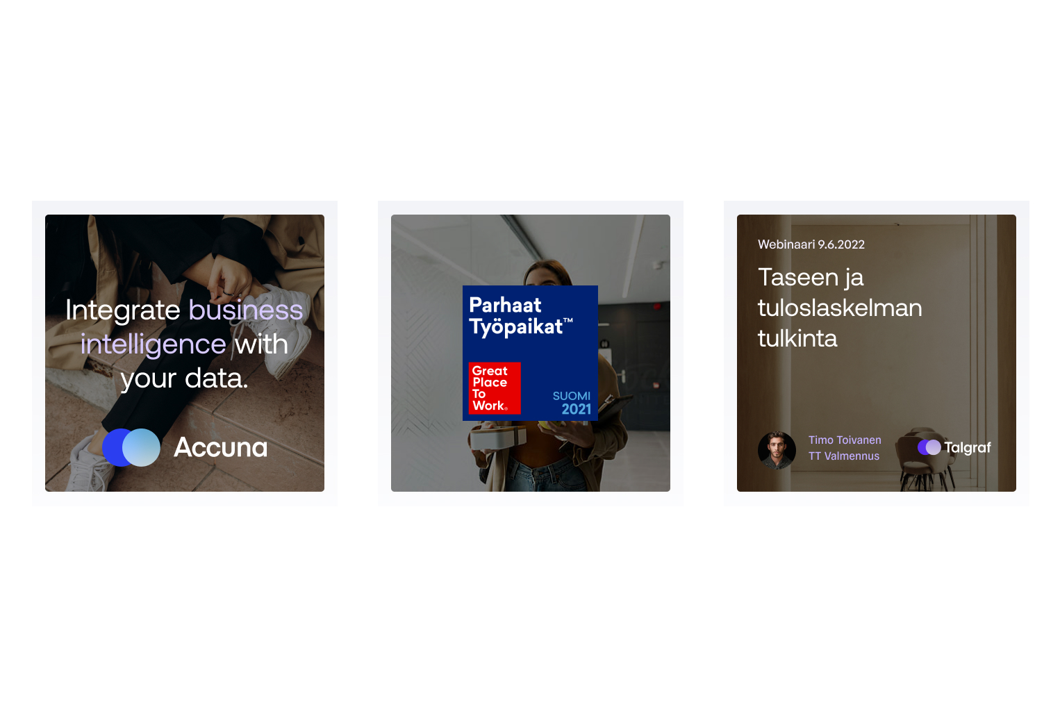
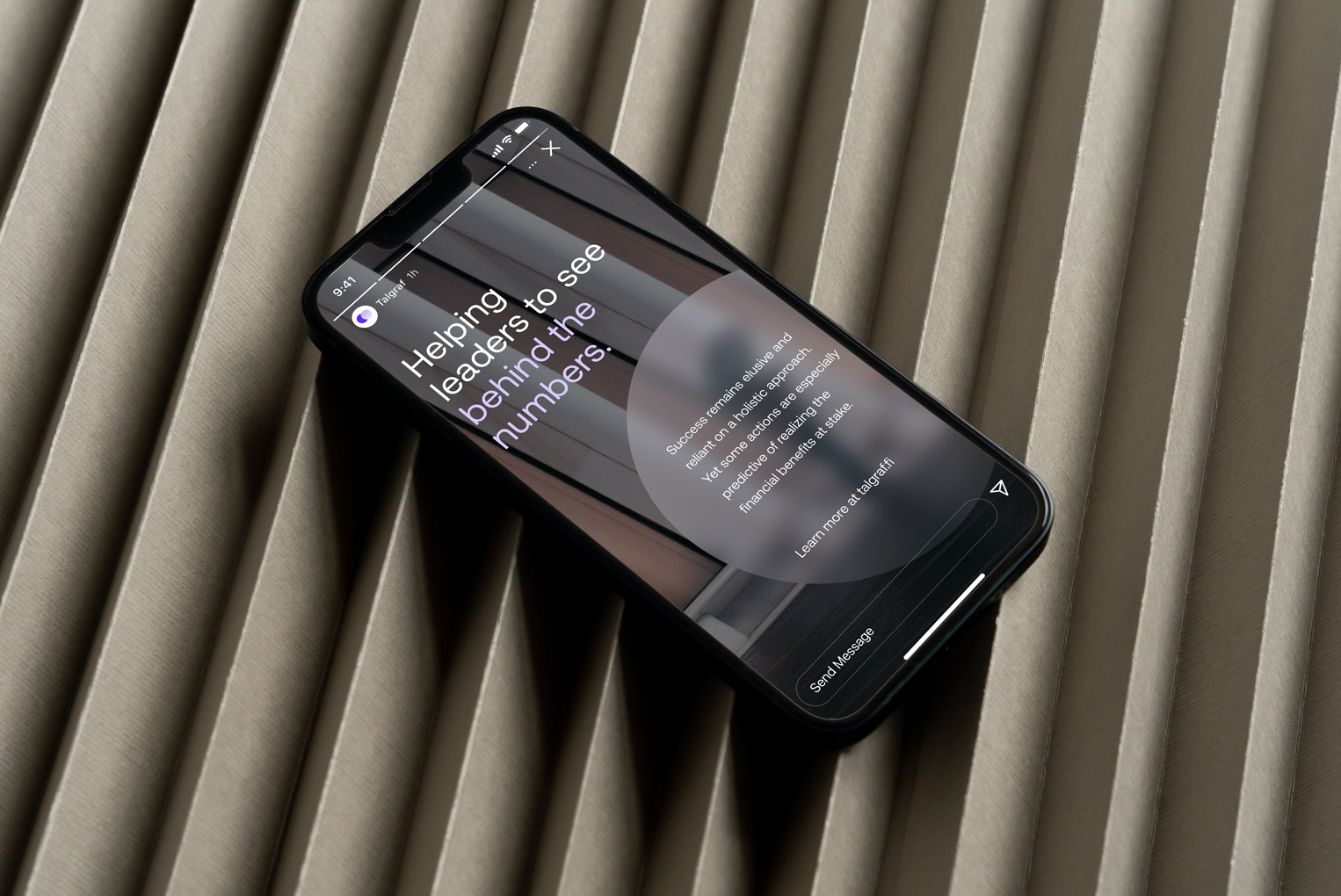
Image style
Brand photography is intended to give a human touch to our brand. The function of photos is to praise industry leaders, emphasize their process, and describe why and how they make a difference. Secondly, the photos should portray our team and expertise, as well as who we are as a firm and people. Photographs should be down-to-earth, inspirational and capture people in their everyday life, whether at work or elsewhere.
Note: All photography used within this page are references ONLY.


00
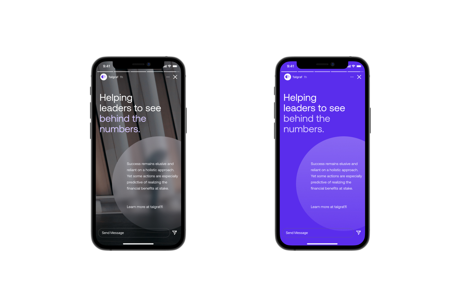
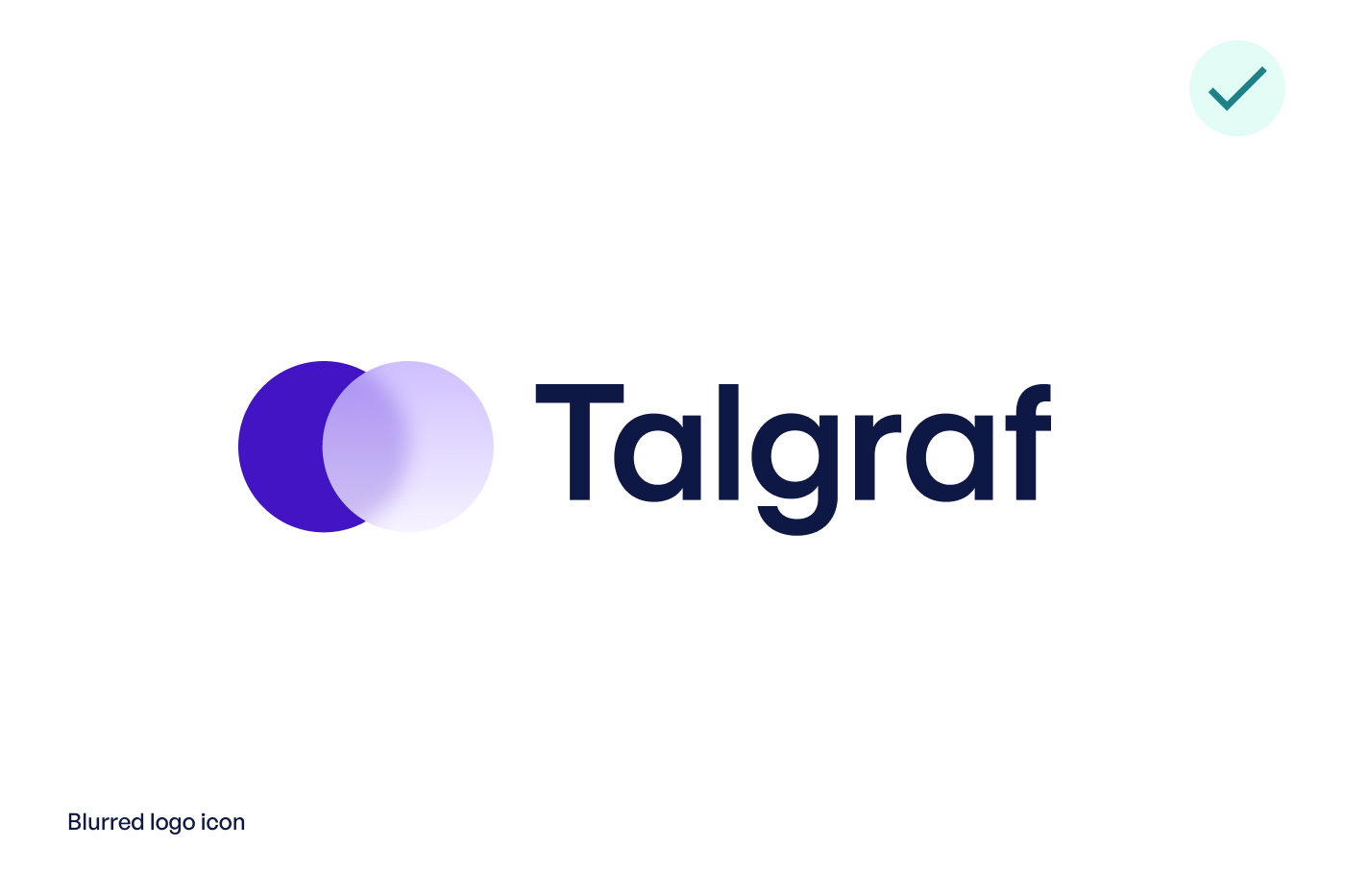
Graphic elements
Our graphic elements are based on the idea of “seeing behind the numbers”. You can utilise brand’s blurred circle shape as a background element for text or logos. The blurry circle is intended to pique interest and leave a lasting impression that there is something beyond what is seen. Only use this technique on larger surfaces for optimal results.


00
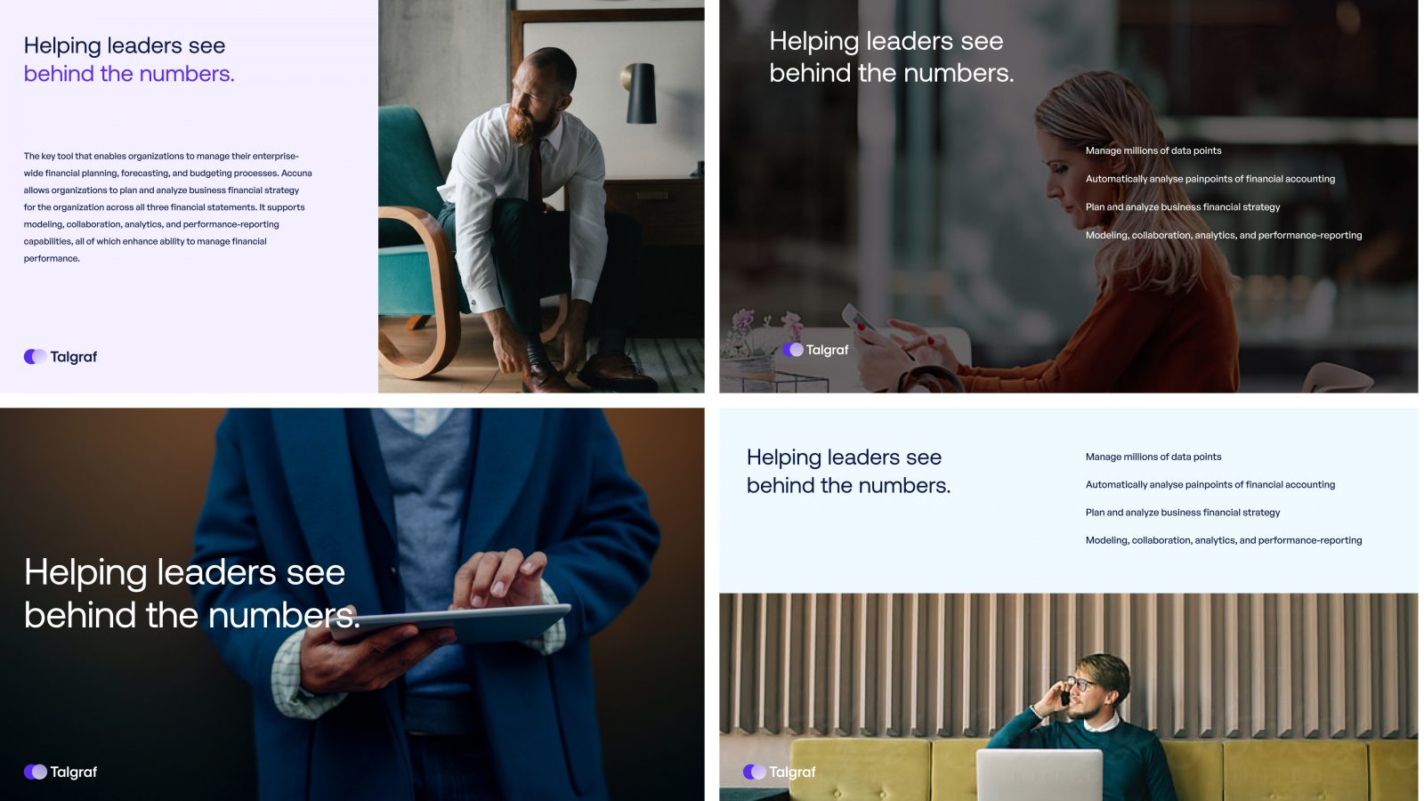
Presentation style
Examples how to apply the new identity across slides and presentations.

00
Downloads
Materials and downloads for internal use. Do not share licensed material outside Talgraf.
